So you’ve written a book. That is a huge accomplishment. You must feel ready to kick back on a sandy beach somewhere with a Mai Tai in one hand and the latest season of Game of Thrones on your tablet. But wait, don’t book those tickets to Tahiti just yet, because your work is far from over.
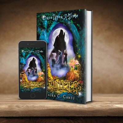
A book isn’t finished when the last word is written. A book isn’t even finished when it’s formatted and edited. A book is finished when it is tightly bound in a unique cover, something far easier said than done. Luckily for you, we’ve got a few ideas about how to make a cover that does your story justice.
Do Hire a Professional
It may feel tempting to tackle the job alone. After all, nobody knows your book better than you. But unless you have some serious chops as a graphic designer and artist, you might want to think again.
This is no simple task and hiring someone who has done it several times over will make your life a lot easier and increase your book’s chances of success. Make sure the graphic design artist has completed work on book covers before and is willing to work closely with you on the project.
Do Cultivate a Mood
Book covers are as much about feeling as they are about content. They can feel whimsical, sad, funny, frightening, etc. Bookstore browsers should be able to glance at your book and get a sense for the mood and tone of the novel. The feeling should draw them in and give them a broad view of the kind of story they can expect.
Don’t Be Too Literal
Obviously, you want your cover to accurately reflect the content of your story. But it doesn’t need to cover everything (no pun intended). Basically, we’re telling you to keep an open mind about what your cover could be.
Some covers can be a little more literal while still leaving space for a little mystery and imagination. Erin Morgenstern’s Night Circus does this with a black and white circus tent and human figures. Other covers can be highly symbolic but still accurately portraying the mood and themes of the story. Stephanie Meyers’ Twilight does this with the simple apple in the hands, symbolic of the temptation of Eve.
Don’t Ignore Font
Your font can speak to the mood and themes of the story as well. It is, in fact, part of the artwork of the cover and should be treated as such. Choose a font that is easy to read and in keeping with the tone of the rest of the cover. Vikram Chandra’s Sacred Games is an excellent example of this. The banner script is as elegant and pulp as the novel it represents.
Do Make It Pop
This doesn’t have to mean bright colors and bold text unless that’s what your novel calls for. Really, this means creating a cover that draws the eye and cultivates interest. Highly stylized covers that view easily from a distance are best for this.
If you need more inspiration, think of Yann Martel’s Beatrice and Virgil or Ruth Ozeki’s Tale for the Time Being. They’re covers are both stark, appealing, and beautiful. What’s more, they are informative without losing any of their mystery.